
My first blog critique on Erin’s website:
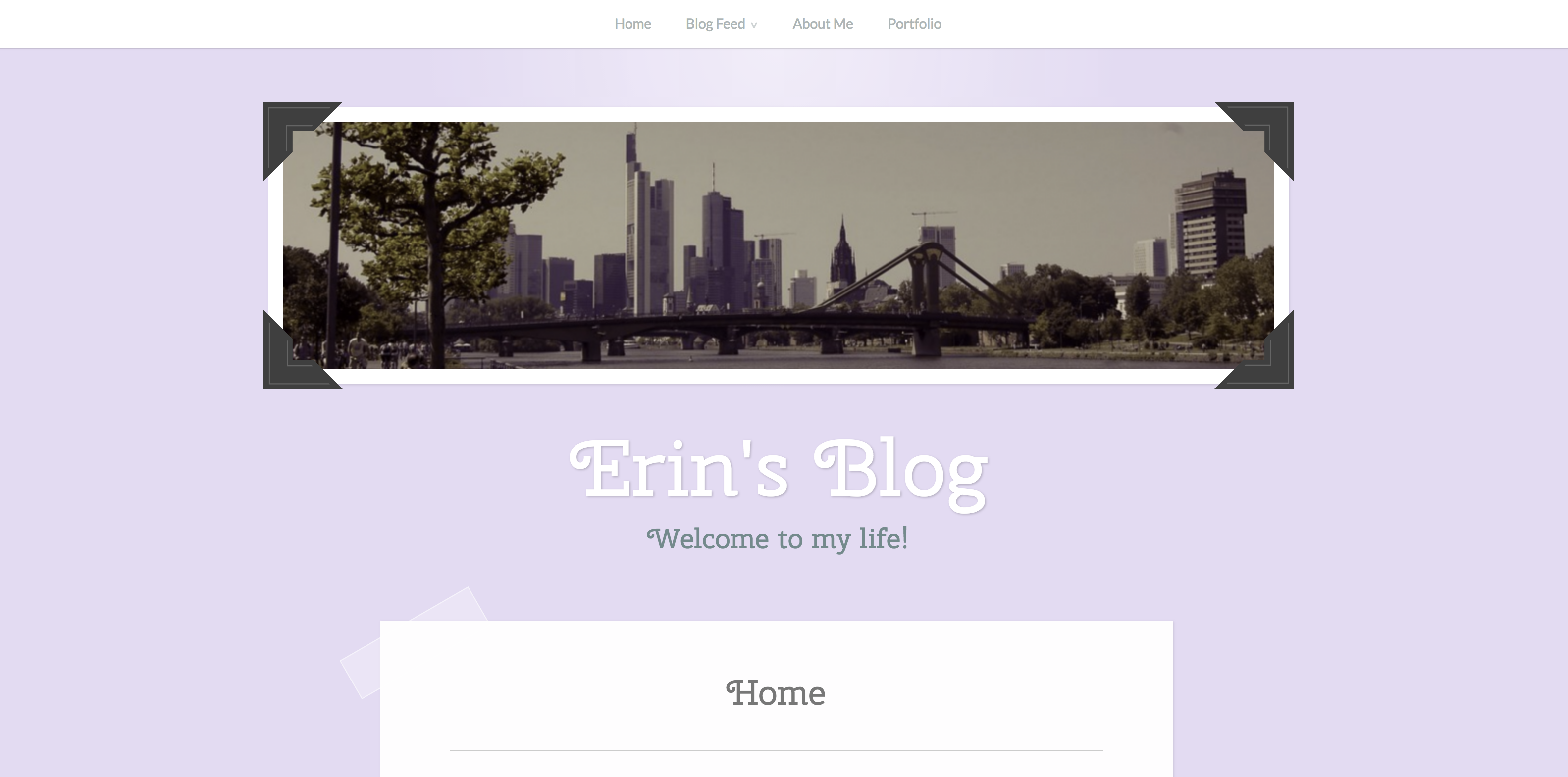
On Erin’s blog, I really enjoyed her home page as it had an intriguing picture and an easy to access menu bar. As soon as I opened up the site, I instantly knew where to go and how to access everything I wanted to!

I found it very helpful that Erin had drop boxes for each main category. With this, the whole site felt more organized and I felt I knew exactly where everything was. I tried to figure out how to add drop boxes on my site and was a little confused how, so I am impressed that Erin was able to!
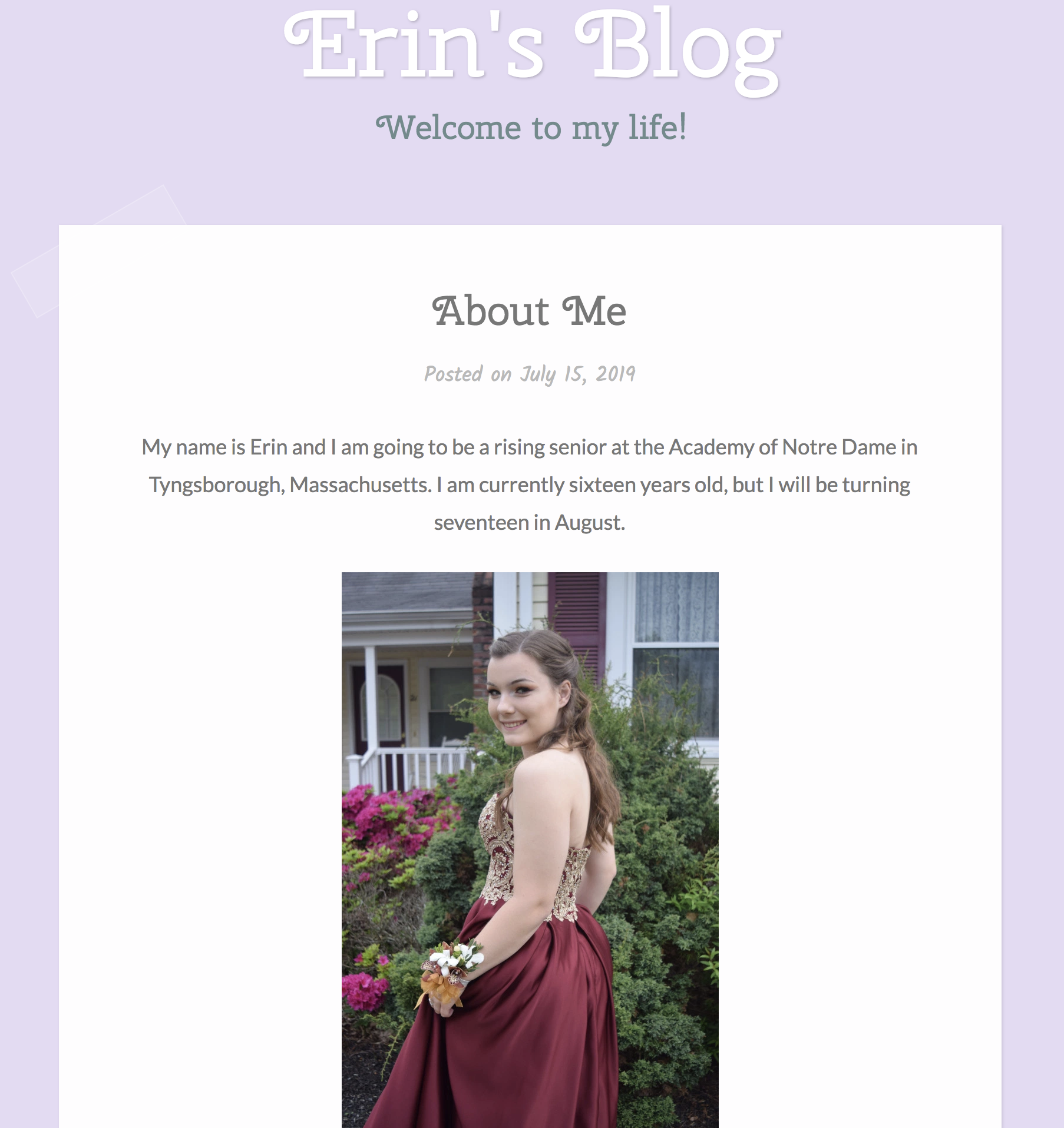
I also really enjoyed how each category was followed with many pictures that were set up in a vertical, scrollable way. This made it very organized and nothing looked cluttered or messy! I also found it helpful that each picture was paired with a matching mini paragraph!
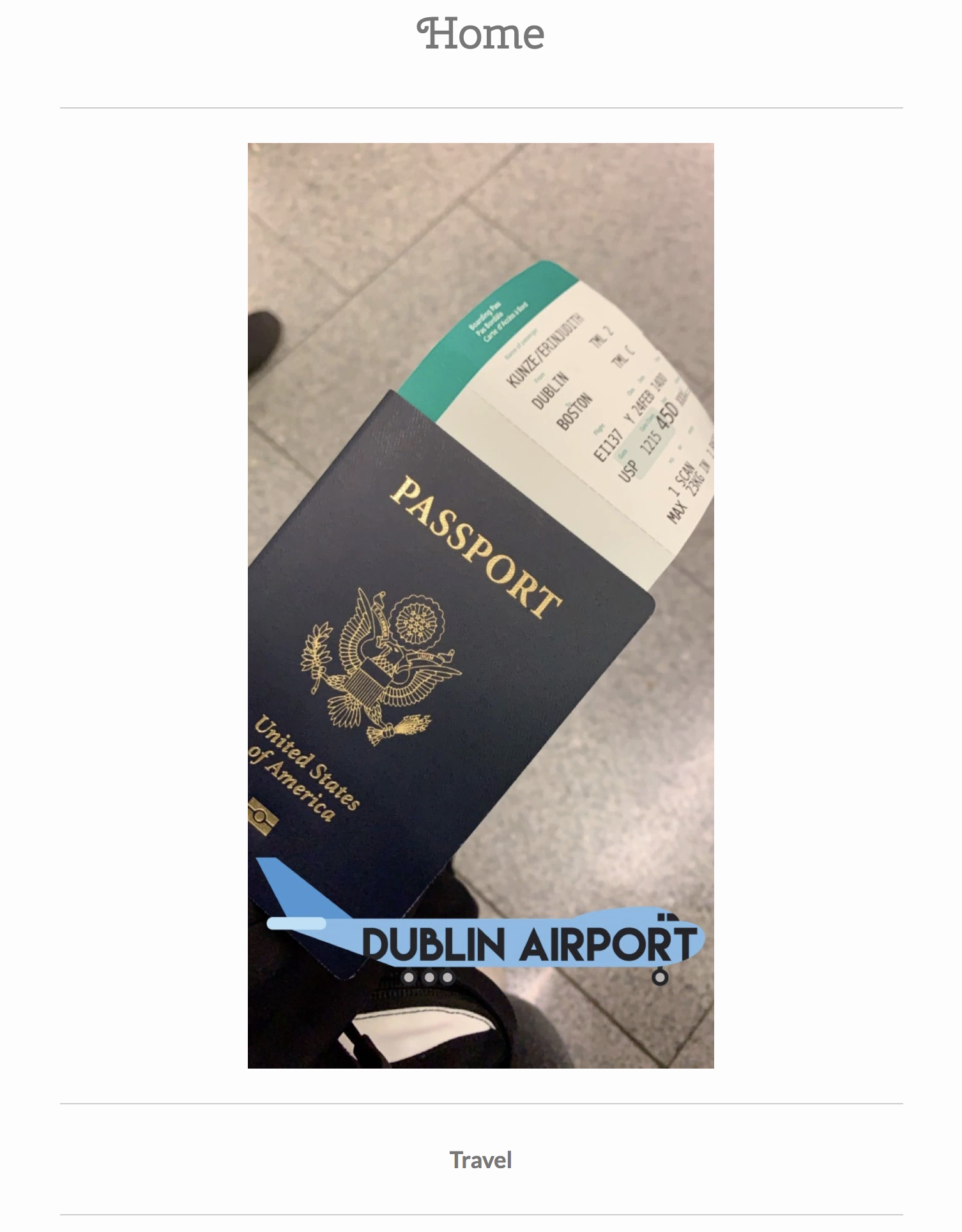
While most of the website was organized and pretty, I did notice one thing that I would like to critique. On the homepage if you scroll done, each main category is written with a matching picture. For example, Travel. I assumed that when you pressed on the written category, you would instantly be sent to the main page of that category. Erin informed me that you aren’t able to access the specific site when you press on the text, which was a little confusing at first.
Overall, I really loved Erin’s website and only had a few critiques. It was organized and leasing to look at and I had a lot of fun reading all about Erin!
 Abby's Blog