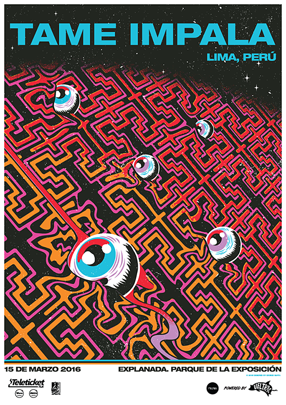
One of my favorite bands is Tame Impala, but unfortunately I’ve never seen them in concert before. This flyer is from 2016 when they performed in Lima, Peru. I love this flyer as it is a spinoff of their Album cover released in 2015 called Currents.
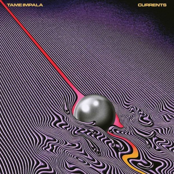
Here is the original album cover
I love how the shiny ball in the original album art was transformed into eyes on the Peru flyer. I do wish the flyer had more words on it though, describing what the show would be like. As you can see, there are only a few words on the bottom stating the date and where the concert will be held. Overall, I really love this flyer and wish I had one to hang up in my room!
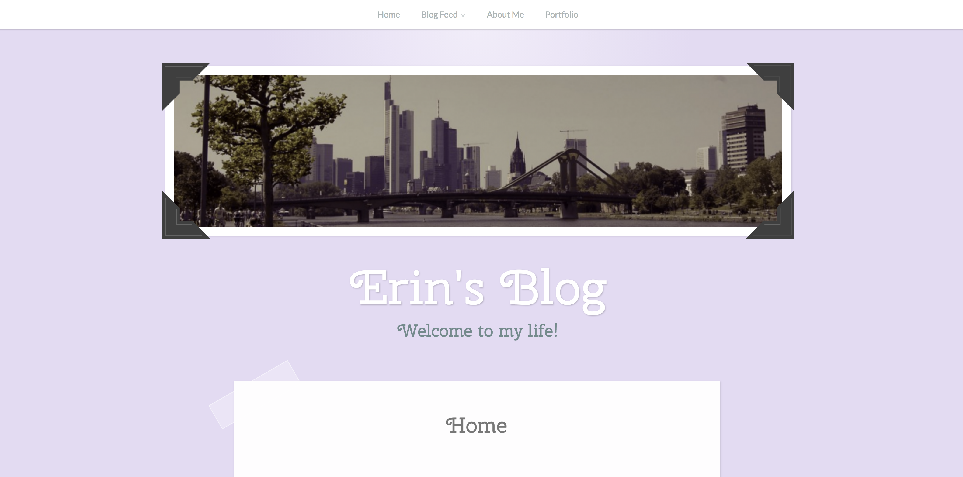
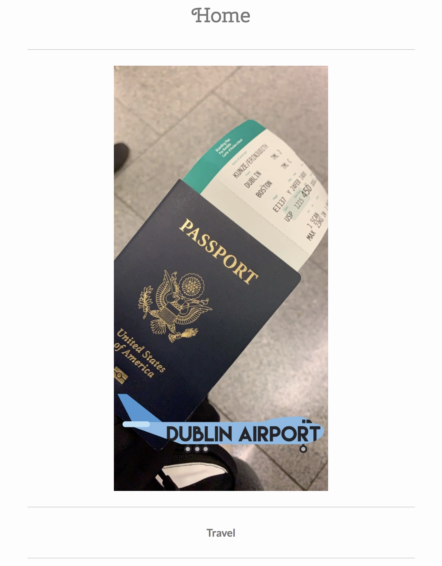
On Erin’s blog, I really enjoyed her home page as it had an intriguing picture and an easy to access menu bar. As soon as I opened up the site, I instantly knew where to go and how to access everything I wanted to!
I found it very helpful that Erin had drop boxes for each main category. With this, the whole site felt more organized and I felt I knew exactly where everything was. I tried to figure out how to add drop boxes on my site and was a little confused how, so I am impressed that Erin was able to!
I also really enjoyed how each category was followed with many pictures that were set up in a vertical, scrollable way. This made it very organized and nothing looked cluttered or messy! I also found it helpful that each picture was paired with a matching mini paragraph!
While most of the website was organized and pretty, I did notice one thing that I would like to critique. On the homepage if you scroll done, each main category is written with a matching picture. For example, Travel. I assumed that when you pressed on the written category, you would instantly be sent to the main page of that category. Erin informed me that you aren’t able to access the specific site when you press on the text, which was a little confusing at first.
Overall, I really loved Erin’s website and only had a few critiques. It was organized and leasing to look at and I had a lot of fun reading all about Erin!
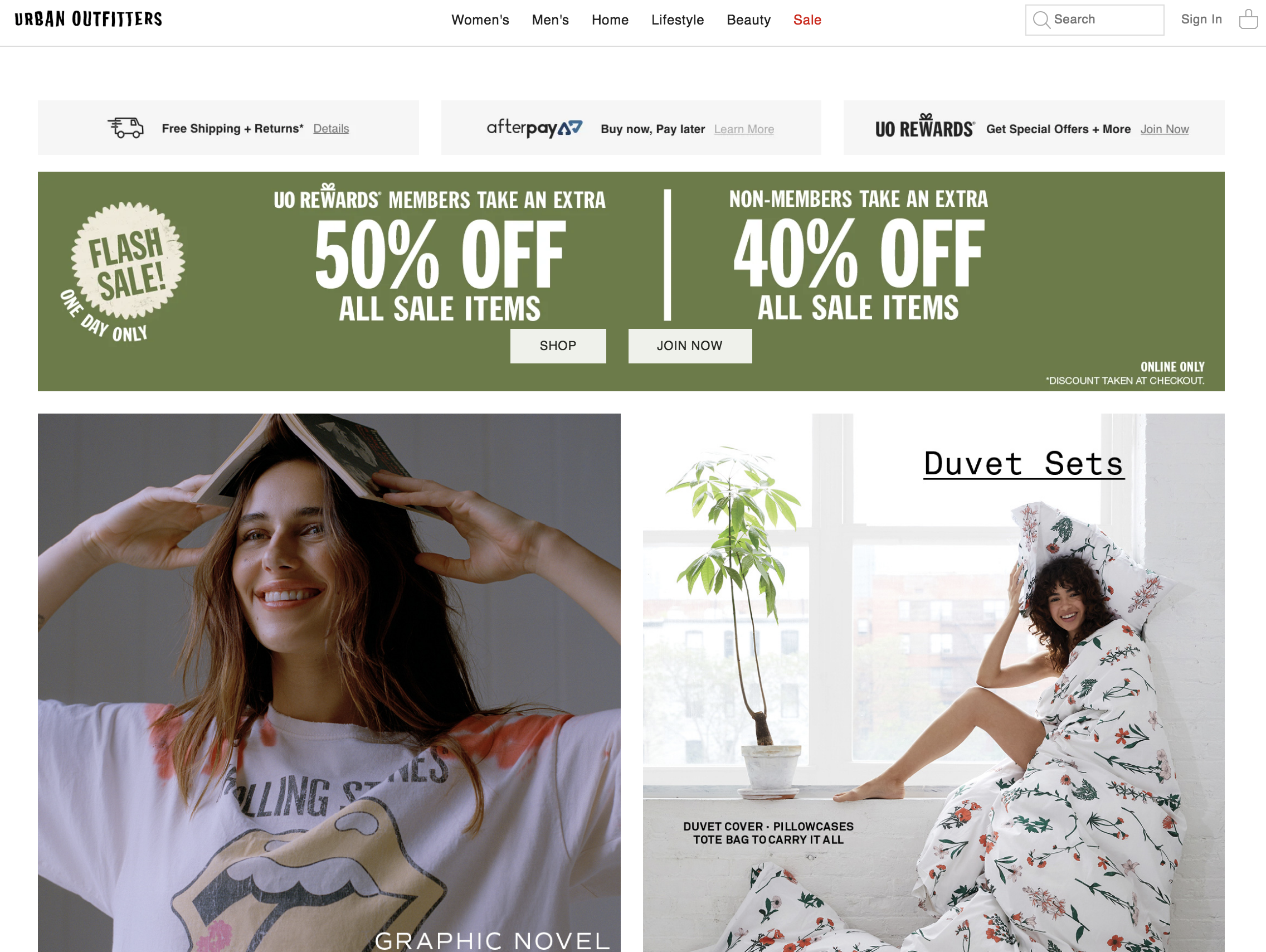
On the home page, the highlighted categories
with pictures do not relate with one another and it is in a random order.
When you press on the categories/pictures that
are highlighted, the item which was highlighted within the picture does not
appear first, so you have to browse through all of the other items to find it.
This website sells other brands clothing as
well, but it is hard to find a tab which lists all of the different brands that
the store sells.
There are many “ads” which try to intrigue
costumers to become part of the members program all over the site.
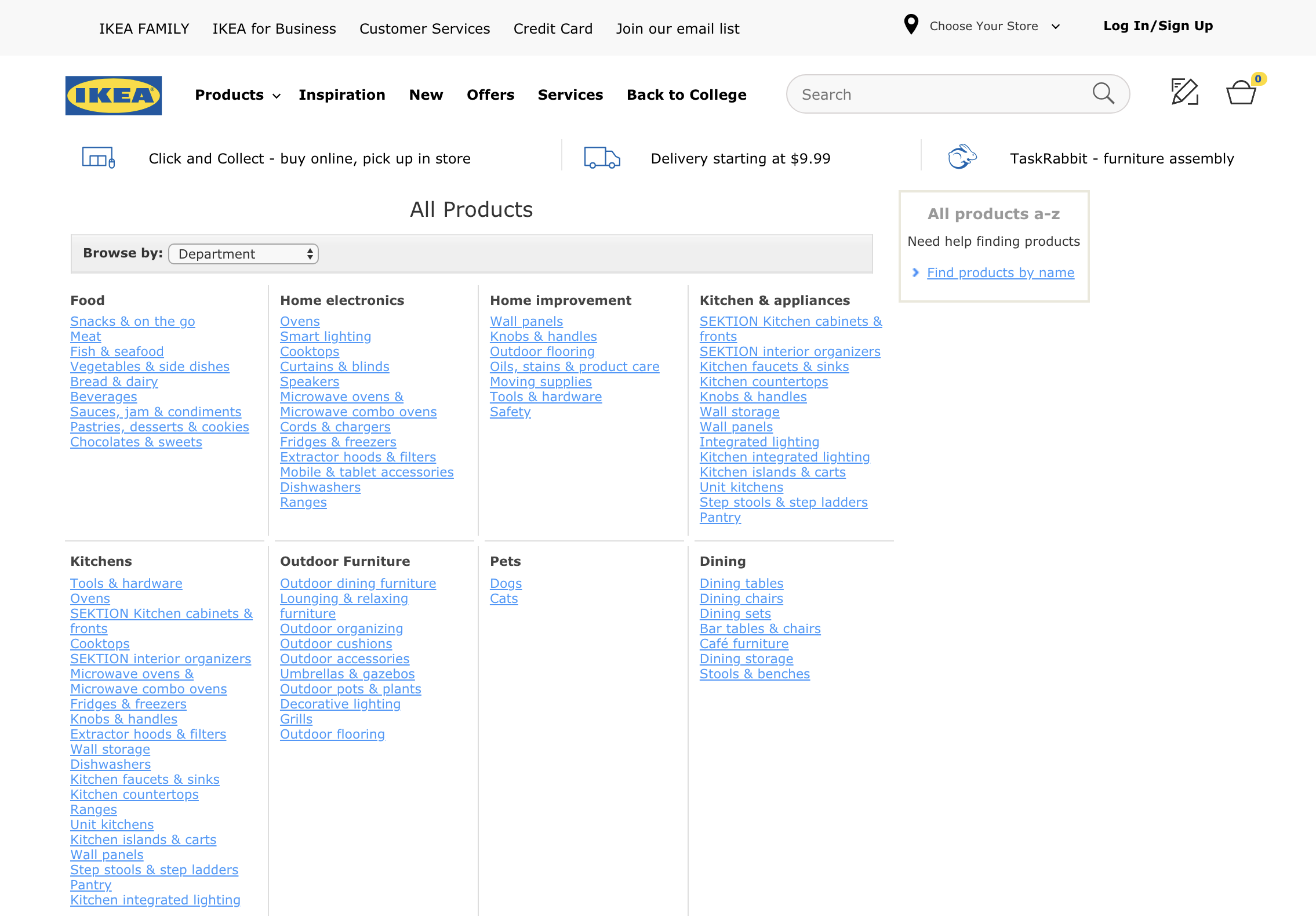
There are no drop boxes under specific
tabs/categories.
The setup is very overwhelming and clustered on
the home page.
When you press on a specific category, the
titles of each specific category or not bolded and blend in with each other so
it is hard to find what you are looking for.
There are no pictures under specific categories,
so it is not very intriguing.


 Abby's Blog